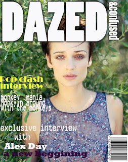
 This is a front cover I created of a magazine. The task was to copy and recreate the styles and conventions from the magazine itself. I tried to do this by analysing the layout and colour schemes for exmaple white text for the heading and copy the positioning of the heading from the original magazine. I looked at the types of audiences that would read Dazed & Confused Magazine and compared it to other magazines to see similarities and differences which helped me create my copy by analysing the orignial copy. I looked at factors like where the heading covered and the postioning of the image, i compared this with previous editions of the magazine via web to see the trends of the front cover and font style/colour schemes which are repated so the audiences can instantly identify and recognise the particular magazine from all the others available. For example Dazed & Confused differs from other magazines because it is not predominantly celebrity gossip or news it is more creative arty and fashion, music related. The colours are not aimed specifically at a targeret gender, female or male specific. The magazine advertises beauty, hair and healthcare products for both men and women but has selected specific brands to tie in with the feel of the magazine and the types of products the readers would take interest in and have a desire to want.
Ive found it much easier to use the tools on photoshop than I had previously. I have become much more used to using the layers and text tools, for example using the right fonts which represent the magazine and placing them etc. I think I still have to develop my skills on using the wand to cut out and edit the shapes of images and backrounds but i think it wont be too hard to master now ive got a basic grip of the tools. I have learnt how to change the opacity of texts and how to rotate texts which will be very useful when I create the front cover for my A-level coursework, I think that by then I will be much more able and confident with alot of the tools on photoshop its just a case of getting used to them and using them to help me understand how they all work. https://blogger.googleusercontent.com/img/b/R29vZ2xl/AVvXsEifnjGSGC3Ka0UxQy0qQ6OKUxfIhd18J9HzhisQJJh2V5qf0bWA7D4t6xHE2I1TS0qyY4inzAKjCyEQoW4F51Km4Lb6dyUfI-P73ZmKy3OEkh1LxwggQ2JLXExsbICEYFy4Y-gLqLp0XqwQ/s400/50947.jpg
This link is an example of the layout of Dazed and Confused Magazines. The layout and front cover often portray arty/indie types of people or musicians portraying a certain image to the reader. I feel the target audience for the magazine is aimed at both men and women of a yougner audience who are into indiviual types of bands and musicians who have an interest in catwalk fashion and contemporary art and films rather than mainstream Hollywood Blockbuster types of films. Audiences who read Dazed & Confused Magazine are likely to read an array of other magazines maybe specialising on hair, fashion, celebrity culture, LadsMags etc but choose Dazed & Confused aswell because it has a bit of everything within it. It has news on music, bands, fashions, interviews, film reviews art etc and it is different from other magazines in the fact it is neutral and doesnot portray stong sexualised vibes or cry out to a certain genger, it is a more specialised and querky magazine targeted at a limited audience.
http://i.models.com/feed/uploads/1165336477_orig_Picture2copy.jpg This is an example of how the magazine targets both Men and Women in a sexual way but a equal way rather than a specific gender and sterotypical features, large breasts and sixpack muscles, perma tans etc which alot of magazines play on in order to attract audiences. This image is strange and eye catching artisitc and individual and anti mainstream which is what Dazed and Confused is all about.